We’ve been very fortunate in getting our hands on the brand new, unreleased Blackberry Playbook, and it’s a beauty.
The Blackberry Playbook is RIM’s first tablet device, and is somewhere between a large smartphone and an iPad, with its screen measuring 7-inches. It features a brand new Operating System designed by RIM (Research in Motion) and QNX, a software specialist RIM acquired earlier this year.
Not due for official release in the UK until June 16th, this is one of the first looks you’ll get at the Playbook, which is set to be one of the hottest tablets around. It’s slick, it looks the part and the new QNX software runs fantastically well – albeit with some features looking dubiously “borrowed” from Blackberry’s rivals.
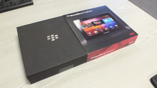
As with Blackberry smartphones, the box and contents are the same black colour. You get a mains charger, Micro USB cable, a host of instruction booklets and a really nice neoprene sleeve to keep your shiny tablet safe. We’d say some headphones and maybe a HDMI out cable wouldn’t go a miss, though.
The Playbook feels heavier than it really is (it’s a good 176g lighter than the iPad 2), but it gives you the feeling that it’s well built and sturdy. We found the 7-inch size to feel much more comfortable to hold and use than a larger 9.7 or 10.1-inch tablet, and it conveniently fits into a suit jacket pocket nicely.


Its design is fairly minimal and sleek with no buttons sticking out of the side; the power key, play/pause and volume +/- buttons are located on the top but are sunk in to keep with the flush look, and the Micro USB, Mini HDMI and Charging Contacts (for a docking station) are hidden away on the bottom edge.
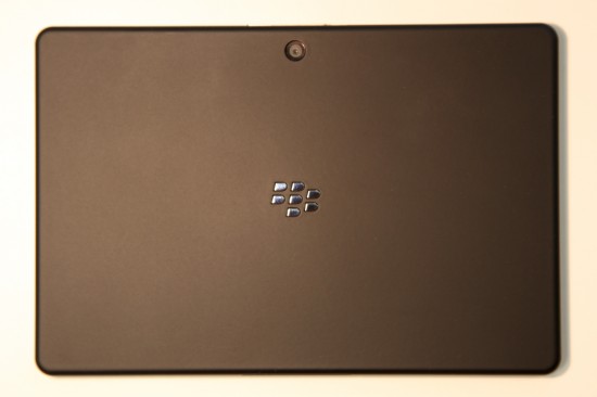
A soft-touch material has been used on the back of the device which makes it even more pleasant to hold, and gives it some grip while you’ve got it in your hands. Centre to the back panel is the familiar chrome Blackberry symbol, and at the top the 5-megapixel rear camera.
Press the power button and you get the familiar Blackberry loading screen, sans loading bar. Give it a few minutes and you’ll be into the home screen of the tablet – you’ll find it looks quite similar to that of Blackberry’s 6 OS used on smartphones such as the Bold 9780. You’ve got the same style of app tray at the bottom of the screen which can be expanded and categorised, the animations for which are super fast and smooth.
QNX’s operating system is pretty intuitive and pleasant to use, though it took us a while to get to grips with a few things. For instance, to close an app you have to swipe from the bottom of the screen bezel upwards, which minimises each open app to a “tile” in the centre of the screen. It works really well and is very fast.
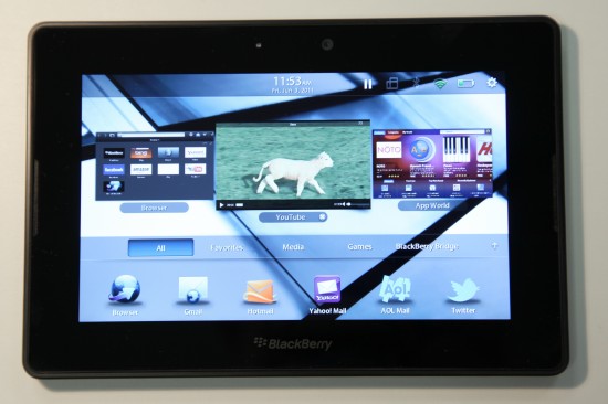
You can scroll through your open tiles and simply tap one to open. To close an app, you tap and hold on it and swipe it up and off the screen. This function is very, very similar to the tiles functionality on the Palm OS, and almost seems borrowed, but it works well.
Each tile is “live”, meaning it will continually show what’s going on in that program. So for instance, you could be playing a YouTube video full screen, minimise to the home screen and continue watching while doing something else.
The “smart bezel” is the gloss black area around the screen, which responds to touch in certain areas. App menus are hidden away, but a swipe of your finger from the top of the bezel downwards onto the screen will bring out any hidden menus. This keeps the screen clutter-free and gives you more screen real-estate to view pictures, movies and web pages with.
Pretty much everything looks super clear and sharp on the Playbook’s screen, with the 600 x 1024 resolution and PowerVR SGX540 GPU doing their job fantastically well. Video looks absolutely great especially in Full HD, and when placed side-by-side with the iPad 2, the Playbook looks to be giving Apple a run for their money. We were very impressed to say the least.
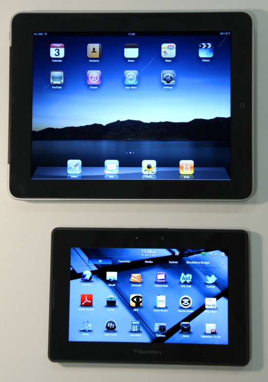
Overall we’ve been very impressed with the Blackberry Playbook from our time spent with it. It’s not an iPad killer in any sense, but it’s fast, smooth, looks great and it’s much easier to hold. RIM will need to add dedicated Contacts, Mail, Calendar and Blackberry Messenger apps soon though, as it’s a tad ridiculous that the Playbook doesn’t have them.
What do you think of the Playbook? Dying to get your hands on one? Feel free to ask us anything about it via a comment or by Twitter, and we’ll answer you as best we can!
