We at the Gadget helpline have recently got our hands on the incoming HTC One smartphone and we must admit we are a little bit smitten with the devices as its sleek design and quality build has really wowed us.
And even though the HTC One has been delayed somewhat we still think the handset will be a big hit when it is eventually released due to its stylish ascetics and decent stats.
So we have done a visual comparison between the HTC One and its predecessor the HTC One X to showcase the differences between the handsets.
Front:
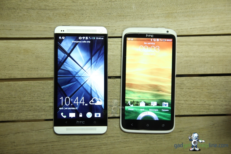
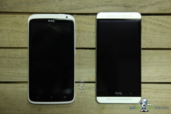
As you can see form the front the two devices have a drastically different design with the HTC Ones X (left) sporting a rounded more curved feel (not to mention so big scratches!) and the new HTC One taking its cue form Apple and BlackBerry with its new straight edge design.
Both devices sport a 4.7 inch display but the HTC One has a 1080 x 1920 pixels 469 ppi pixel density vs the HTC One X’s 720 x 1280 pixels 312 ppi pixel density.
With the screens on you can see the difference between the HTC Sense and HTC Sense UI v5 vs the older HTC Sense on the One X.
Back:
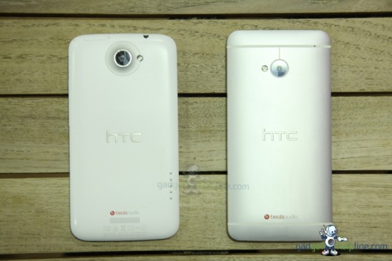
The back of the devices again show the difference in design with the curved tapered edges of the HTC One X gone,but both handsets still sport the BeatsAudio branding that is incorporated into the devices. Also missing is the dock connectors form the One X.
Side – Left:
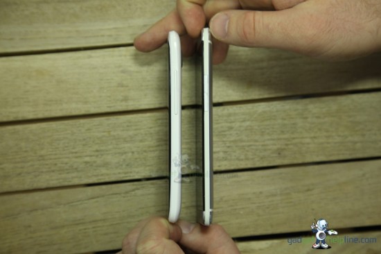
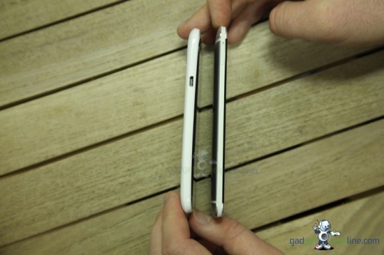
The left side of the One has the same volume rocker button and nothing else but as you can see the newer HTC One is slightly smaller with a flat side to the device but the back expands up to a larger 9.3mm compared to the One X’s 8.9mm thickness.
Side – Right:
The HTC One has moved the Micro USB port form the left side to the bottom of the handset and other than a flush Micro SIM Card port (which is only accessible with a port Pin) the side is clean and pretty much empty.
Top:
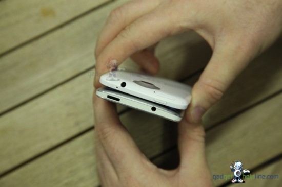
The top of the devices see’s a differences in the Headphone jack and Power buttons being swapped over so if you are left handed this may be a pain for the new HTC One but for right handed people, and the move of the Sim card port to the side.
Bottom:
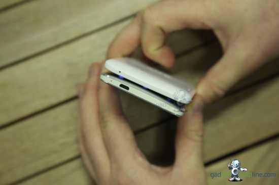
The only change on the bottom of the HTC One is that this is where the Micro USB port is now situated.
That’s it for our hands on comparison, we love the new updated design for the HTC One handset and after our long affair with the previous HTC One X its great to see HTC upping the design stakes. Keep tuned for a video review in the coming weeks.
