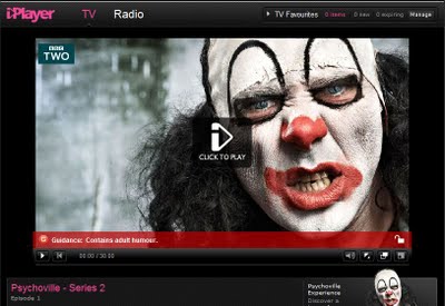
The Beeb have announced plans to reboot its iPlayer interface making the user experience more fluid on its native television set platform.
BBC’s on-demand television service iPlayer was launched on Christmas Day 2007, and has only had one redesign to its appearance and function in June of the following year. All this time the interface has remained chunky and blocky, and the “red button” service has always been quite slow to navigate, with limited options per “page” and generally lacklustre visual appeal. One of the most troubling factors with the current mode is that when you’re browsing the vast choice of programming your existing programme is partially hidden behind. With hope, the newly “TV-friendly” iPlayer interface will remedy this issue.
While the TV service has become a little stagnant, digital radio playback has been introduced and the BBC has since focused much of its attention on developing, firstly, the web-based version of iPlayer, followed by Android and Apple iPhone mobile platforms. Now further beyond that with the iPlayer debuting on iPad and beginning to take to Europe.
The Beeb’s plan for its playback service is now to make the original more like the successors, by coming full circle and bringing the flowing style and packed interface of web-based iPlayer onto TV.
BBC’s General Manager of Programmes and On-Demand, Daniel Danker says “BBC iPlayer has been tremendously successful. With today’s announcement, we’re transforming iPlayer in its most natural home: right on the living room TV. By creating a product that’s as simple and intuitive as flicking through TV channels, the BBC is bringing on demand television to mainstream audiences across the UK.”
Auntie’s roll out of the newly revised iPlayer for our telly is set to roll out in the “next few months” and in a somewhat counteraction the first place you’ll find it is on your Playstation 3.
Send us your thoughts via tweet to the Official Gadget Helpline Twitter or drop us a comment on our Official Facebook page!

