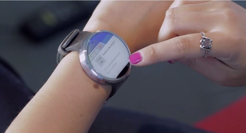
Whilst similar to the presentation at Google I/O, a new Moto 360 video has been released, detailing the device in use and some of its features and menu items.
The video is the first to show the watch in its full glory, complete with actual images of the device in action on a real person’s wrist, as opposed to press renders and other computer generated 3D images.
The materials used in its construction are clearly visible, you can see the genuine leather used in the strap, the robust stainless steel casing, plus there’s a hint of the Sapphire glass screen in there as well. It also seems thicker and chunkier than previous renders have shown.
The display is also well demoed, and appears to be bright, high resolution and perfectly clear. It appears to be the closest to any real mechanical watch out of all the Google I/O Android Wear wearables. A recent competition to determine the face of the Moto 360 has recently been concluded, here is the winning entry.
You can see why Motorola chose this one, all the relevant buttons and confirmation icons are on there, there’s a gmail, SMS and phone buttons, plus a power indicator. Illuminated icons confirm whether some functions, such as BlueTooth and Wi-Fi are active. Out of the runners up, this was the only design that incorporated these features, with most designs appearing to be a bit ‘futuristic’ not necessarily incorporating the most basic appearance one comes to expect from a watch, i.e. hands and a traditional face.
You’re still going to have to wait for the Moto 360. Google announced at I/O on the 25th of June that Android Wear devices were about to become available for preorder, but this did not include the Moto 360. The device has been demoed, yes, but no concrete release info has come about, yet.
Speculation and leaks are abundant, however. We recently reported some purported release statistics and estimated prices, but whether they were on the money is yet to be seen. Your best bet would be waiting for this exceptional SmartWatch to come out.
Source: Motorola

