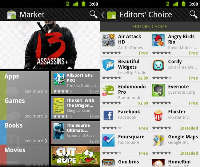
The new Market is, from the ground up, a more graphical affair, with larger buttons, less fiddling and an ethos on being easy to navigate. to that end, the splash screen now shows the simple option to look at apps, games, books or movies.
Books and movies are currently US only addition, but you can buy the former and rent the latter through the store fairly easily, with no syncing involved. The apps and game pages are now much more visually laid-out, and google has taken a leaf out of Apple’s book with quick access to large ‘Top Paid’ and ‘Top Free’ apps.
The new look is available on any handset with Android 2.2 (FroYo) or above, and is the latest in a long line of steady improvements that are taking Android from its geek-heavy origins to a more universally pleasing UI. Are you a fan? Let us know on the Gadget Helpline Twitter feed.

