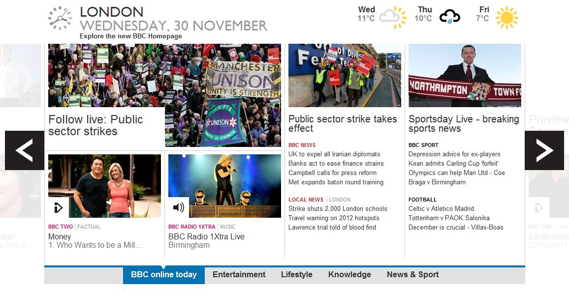
Back in September the Beeb launched its refreshed website homepage as a Beta test and it seems that Auntie is very pleased with its progress. Pleased enough with the increased traffic to the site since then that she’s decided to unscrew the stabilizers and let the broadcasting corporation’s new online interface go official!

James Thornett, the BBC’s Production Manager says “Results from the beta test site indicate that the majority of BBC websites have received a greater proportion of traffic from the new homepage.” He does on to talk about the masses of feedback the trial has invoked “Since the beta launch ten weeks ago we’ve had three hundred comments on the blogs, over twenty thousand responses to our online survey, and over two and a half thousand direct emails.”
The new homepage employs a lot of that trendy white space that’s appearing on websites lately and the BBC have taken with a minimalist approach with the new look. You may notice the sites also taken on a tiled appearance. Scrollable tiles feature snippets of programming info and top news, with option to view Entertainment, Lifestyle, News and Sport more specifically and linking to more in-depth items at a click of a mouse. The tiled interface somewhat resembles the recent ‘Mango’ update for Windows Phone. Co-incidental – or has someone been taking notes?
Thornett previously spoke of uniforming the Beeb’s online presence across web, TV and portable gadget such as smartphone and tablet: “We are already looking in advance, and thinking about how this would appear on a mobile platform. With the user interaction and design, you can see how tablets could easily be adapted and we are also talking with our colleagues across the business of TV. There are interesting discussions around the converging of TV platforms in the future as well.”
It’s a stylish new approach and we recommend you check it out now at www.bbc.co.uk.
Let us know your thoughts on our comments below or via our @Gadget_Helpline Twitter page or Official Facebook group.
