If tablets have thrown up one major problem to website and app developers, it’s this: how do you make something functional and easy to use on on a touchscreen device? It’s an issue that Google’s clearly been thinking about of late, as it’s just added another app to its list of redesigns: Google Docs.

Don’t kid yourselves; the recent redesign of Google’s search page and Gmail had nothing to do with Google+, it was all about making things bigger, cleaner and easier to control with your thunky thumbs. Google Docs has just joined the list, by adopting the far simpler red and grey look, with less screen cluter and larger icons.
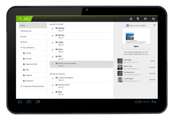
Similarly, the Google Docs app for Android Honeycomb tablets has had a complete rethink, now sporting a three-pane look similar to the Mail app on Macs and the iPad. All of which should make it easier to navigate and use on Google’s current breed of tabs. Love or hate Google’s new red and grey clothes? Let us know your thoughts on our comments below or via our @Gadget_Helpline Twitter page or Official Facebook group.