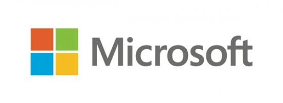
As part of the Re-Brand Microsoft has revamped its official Microsoft logo for the new releases that are set to be released at the end of October.

The biggest change is to the Microsoft Logo where the firm has taken a clean and symmetrical approach to the Windows design that fits in with the companies new Modern User Interface and its home screen tiles system.
We at the Gadget Helpline like the new simple design and think its brings a classy and clean approach to Microsoft’s logo, but many others are suggesting its too Square and that its simply quite boring.
Microsoft has uploaded a video showcasing the launch of the new logo.
A major part of Microsoft’s new Windows 8 system is the rectangular tile design that has been a feature of Windows phone 7 and has been expanded and updated to the whole Windows OS for all devices, so the updated Logo seems to fit with this new design.
You can read more about the logo change on Microsoft’s blog.
Let us know your thoughts on our comments below or via our @Gadget_Helpline Twitter page or Official Facebook group.
