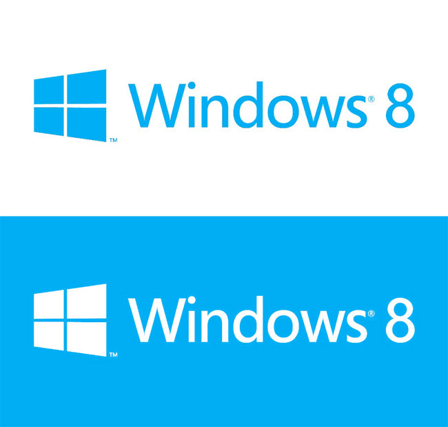
Microsoft has just unveiled its design for the latest version of the Windows operating system.The software giant tasked designers at Pentagram to come up with a brand new design for Windows, and below is the final result they delivered.
Those of you that are fans and frequent users of the operating system may notice that the new Windows 8 logo seems to take inspiration from the first ever Windows logo for version 1.0. However, it also seems to be heavily inspired by the new Metro design that features on the Windows Phone 7 OS.
When asked about the design, Microsoft explained their reasons behind it:
“The Windows logo is a strong and widely recognized mark but when we stepped back and analyzed it, we realized an evolution of our logo would better reflect our Metro style design principles and we also felt there was an opportunity to reconnect with some of the powerful characteristics of previous incarnations.”
I personally like the new design, I think it looks clean and simple compared to previous versions of the logo which were overfull with colours and a bit naff in my opinion. But like all designs, you will never please everyone, however I think Microsoft will have the positive majority with this one.
What do you think of the new Windows 8 design? Let us know your thoughts on our comments below or via our @Gadget_Helpline Twitter page or Official Facebook group.

