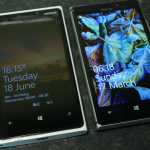
Nokia’s new flagship Windows Phone is out now in stores across the UK, but what differentiates it from the similarly named and also recently launched Lumia 920? We set about find out what Nokia has changed to make the Lumia 925 a worthy successor and indeed purchase.
There are a number of details that would lead you to quite rightly think there is little difference between the two phones – both run Windows Phone 8, both have 8.7 megapixel PureView cameras, both have the same processors and graphics chips, and so on.
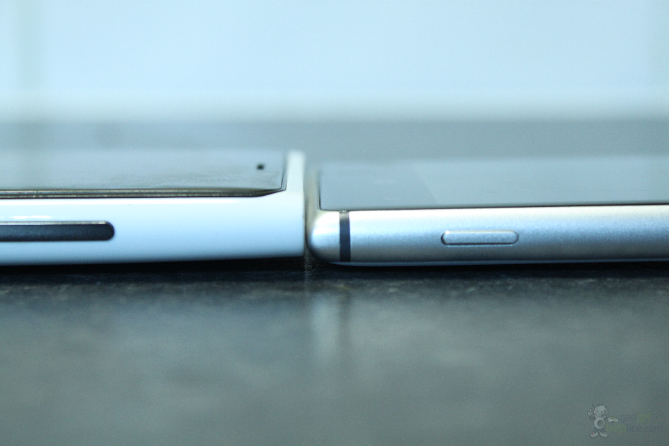
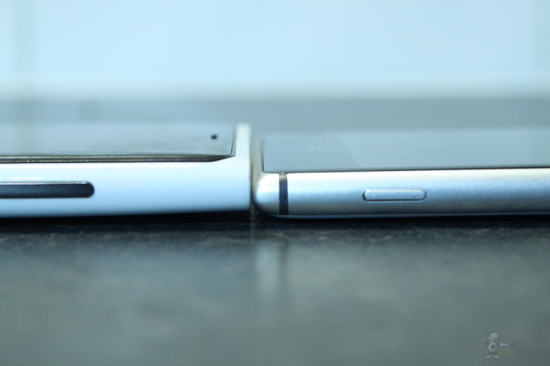
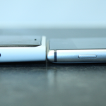
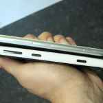
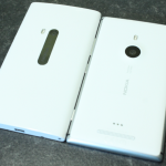
The design are contains the biggest difference, or differences rather, as there are lots of them. Our gripes with the Lumia 920 being a thick and heavy tank of a phone are no more with the Lumia 925. It’s loads thinner and most importantly, a lot lighter, making the phone much more pleasant to hold and easier on the pockets. In figures, the 925 weighs 139g to the 920’s whopping 185g, and measures up at 8.5mm thick compared to the 920’s rather chunky 10.7mm.
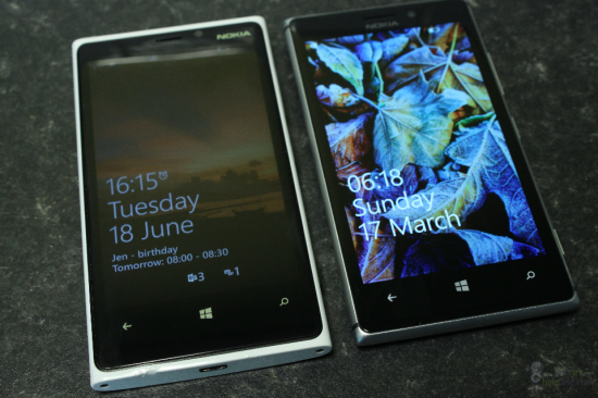
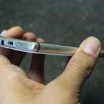
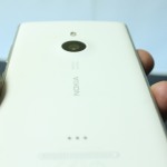
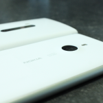
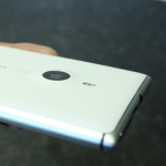
Nokia has also switched up the materials used, which we think makes the phone feel more premium. It’s a case of out with the plastic and in with the metal, with a silver metal band running around the edge of the 925. The front of the phone is still a glossy black finish with Corning’s Gorilla Glass 2 for protection, whilst the back panel is a matte finish plastic panel which is non-removable and seems pretty solid. The rear camera is now a slightly raised on the back due to the redesigned lens and features a dual LED flash module above it.
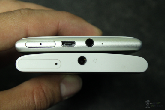
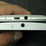
The array of volume, power and camera buttons is the same as on the 920 and located down the left side of the phone, whilst the micro USB port has been moved from the bottom to join the headphone jack and SIM tray on the top edge.
Overall we feel that the Lumia 925 is by far the best looking Windows Phone to date and features a design style that we wish all Lumias before it also had. The metal used gives it a more premium feel and it seems that this, coupled with a slimmer and lighter frame, was all that Nokia needed to do to make the ideal flagship Lumia.
Elsewhere on the phone things have a very similar feel if you’ve used Windows Phone 8 before. The device is nippy and easily flows through menus and between apps with no lag whatsoever, thanks to the dual-core processor inside. Nokia has made subtle changes to the 8.7 megapixel rear camera which will help the phone achieve better quality images in low light. This is achieved by using a new six piece lens construction, differing from the Lumia 920’s five piece lens, which causes the rear camera to protrude slightly on the back.
Overall the Lumia 925’s subtle upgrades and major design change are enough to make it the new forerunner in the Windows Phone space. Speaking of space, watch this one for a full video review of Nokia’s latest blower!
