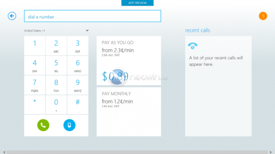
Images have been posted of the new forthcoming updated Skype application to be released with the new Windows 8 operating system in October.
When a new OS is released developers are encouraged to use the new setup to bring their existing apps into line with the new design aspects of the OS, and in this case it is very important as Microsoft has had a major overhaul to its Windows OS.
The new Windows “Modern UI” (formerly known as the Metro theme) is such a drastic step away from the older versions of Windows (Windows 7, Vista and XP) and so Skype have done a full re-design of the video calling software for the release.
The images showcase the changes that Skype have made to bring it inline with the new design, including; a tidier layout, each person who is involved with a text chat will be assigned their own colour making, tiled setup similar to the Windows 8 home screen, and left to right scrolling between the screen (similar to Windows Phone OS).
There is no official information from Skype regarding the new updated app, but as you can see from the images, the design fits perfectly with the new (ex-Metro) Modern UI theme and looks very polished.
The images coming from the guys at Neowin who are testing out the new Skype app on the Windows 8 development kit. You can check out more images at Neowin.net.
Let us know your thoughts on our comments below or via our @Gadget_Helpline Twitter page or Official Facebook group.
