Sony’s big day is just two days away. The Japanese tech giant will host a PlayStation event on Wednesday February 20th and everyone has high hopes of seeing their next-generation home console, the PlayStation 4.
Whether Sony will or won’t reveal the console on the day, we’ve been spending our days imagining it for years now. Thankfully some very talented graphic designers have been envisioning Sony’s new console too, with some absolutely stunning concept designs popping up. Some concept designs we’ve seen have been downright outrageous, but some could be the real thing – and we’d buy them.
We’ve rounded up five of the best PS4 concept designs from around the world, but which would you have as pride of place next to your TV?
The realistic one
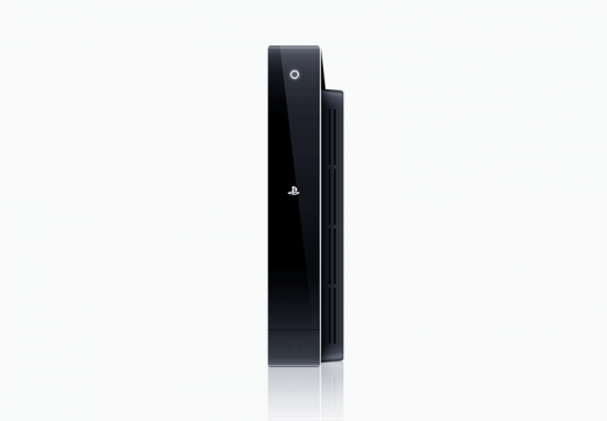
Taking design cues from the PS2 and PS3, this design is the most realistic one we’ve seen to date. Whilst it’s not as futuristic as some, it’s something we could actually see Sony launching. Glossy black finishes to the side, squared edges and illuminated touch buttons all make up a gorgeous design.
Designed by: Gavin Rinquist
The far-fetched one
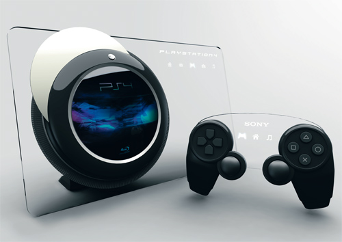
This clear PS4 concept has been around for a long time, and as much as we’d love to see a see-through console with illuminated buttons throughout, it’s not going to happen. Tai Chiem’s design adds the XMB as illuminated icons on the console itself which looks very space age, with a glowing blue orb situated off-centre for game discs and Blu-rays.
Designed by: Tai Chiem
The one that looks like Valve made it
This design differs from all the others by using a tray-loading CD drive, which isn’t something we’re expecting Sony to go back to after switching to a slot-loading drive in the PS3. It’s a pretty industrial design, with lots of polished chrome and black, and it reminds us of Valve and its Steam platform for some reason. An SSD drive is a key feature of this design, which is likely to be a component used in the real console.
Designed by: Artificial Production
The vertical one
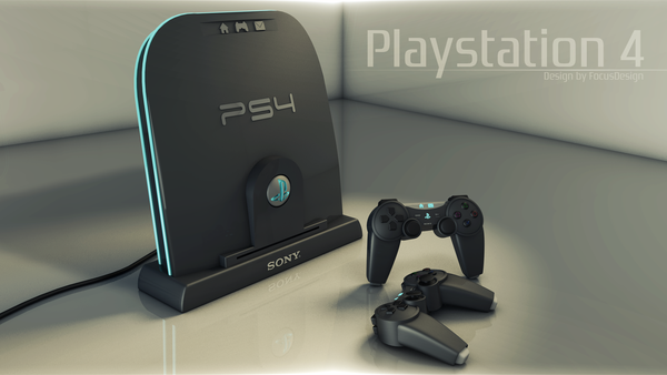
Carlos Fernandes’ design revolves around a vertical standing console with a dock, which kind of makes it look like a tombstone. Included is a concept controller which includes much longer hand grips, much different to the recently leaked prototype design we’ve seen. It’s a neat design, although for some reason the disc slot is at the bottom of the dock, which would feed in from the top, which would make for one rather thick console!
Designed by: Carlos Fernandes
The sleek one
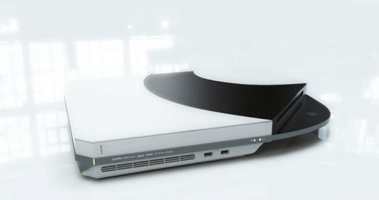
Joseph Dumary’s design falls into the same category as Gavin Rinquist’s in that it looks very much like something that Sony would make. Ultra slim and sleek, this design is built from recyclable materials and features many other energy-conserving ‘Eco’ features to save power. We like how slim the console is overall and the cut-away corner with a curved area housing the disc slot.
Designed by: Joseph Dumary
Which of these designs could take pride of place in your home? Would you like to see Sony reveal something minimalistic and sleek or something completely futuristic and shocking?
