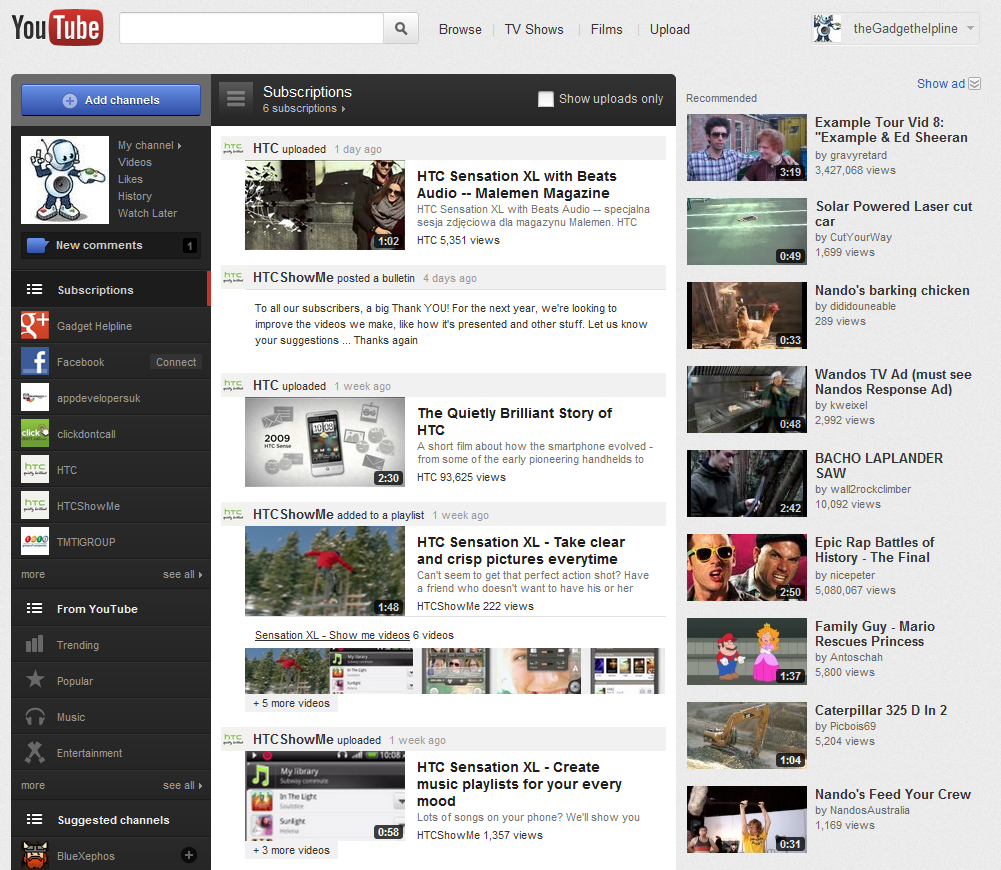
Those of you who enjoy YouTube for a daily dose of humour, music or to catch the latest film trailers should have noticed that the whole thing looks a bit different. As from today the new look clip site aims to keep up with social trending by offering videos in a new selection of categories which offers a quick and easy view for those, who like us, want their clips quick and the latest web fads shared around the office!
YouTube now presents it’s homepage to feature a series of columns including the familiar ‘Recommended’ and ‘Subscription’ latest videos and on the right there is a new addition – a column allowing you to sort through videos by topics such as ‘Music’ and ‘Trending’ which lets you find the day’s most popular vids and share them with pals on Facebook and Twitter. Your new comments and easy access to your personal channel and history are also attached to this portion of the bar which delivers a one-stop start point for all your video browsing needs.
The video pages themselves haven’t been changed too much since that last update, which saw individual videos displayed inside a new stylish black border and off-white background, the same uniform design as used in social site Google+, which incidentally becomes more embedded in the latest YouTube showing what clips friends are currently enjoying.
With YouTube becoming a legit force in online entertainment these’s trend-aware changes make the site a far cry from the days of it being solely a host for laughing babies, dodgy make-up tips and misbehaving pets – “FENTON!”
Let us know your thoughts on our comments below or via our @Gadget_Helpline Twitter page or Official Facebook group.

