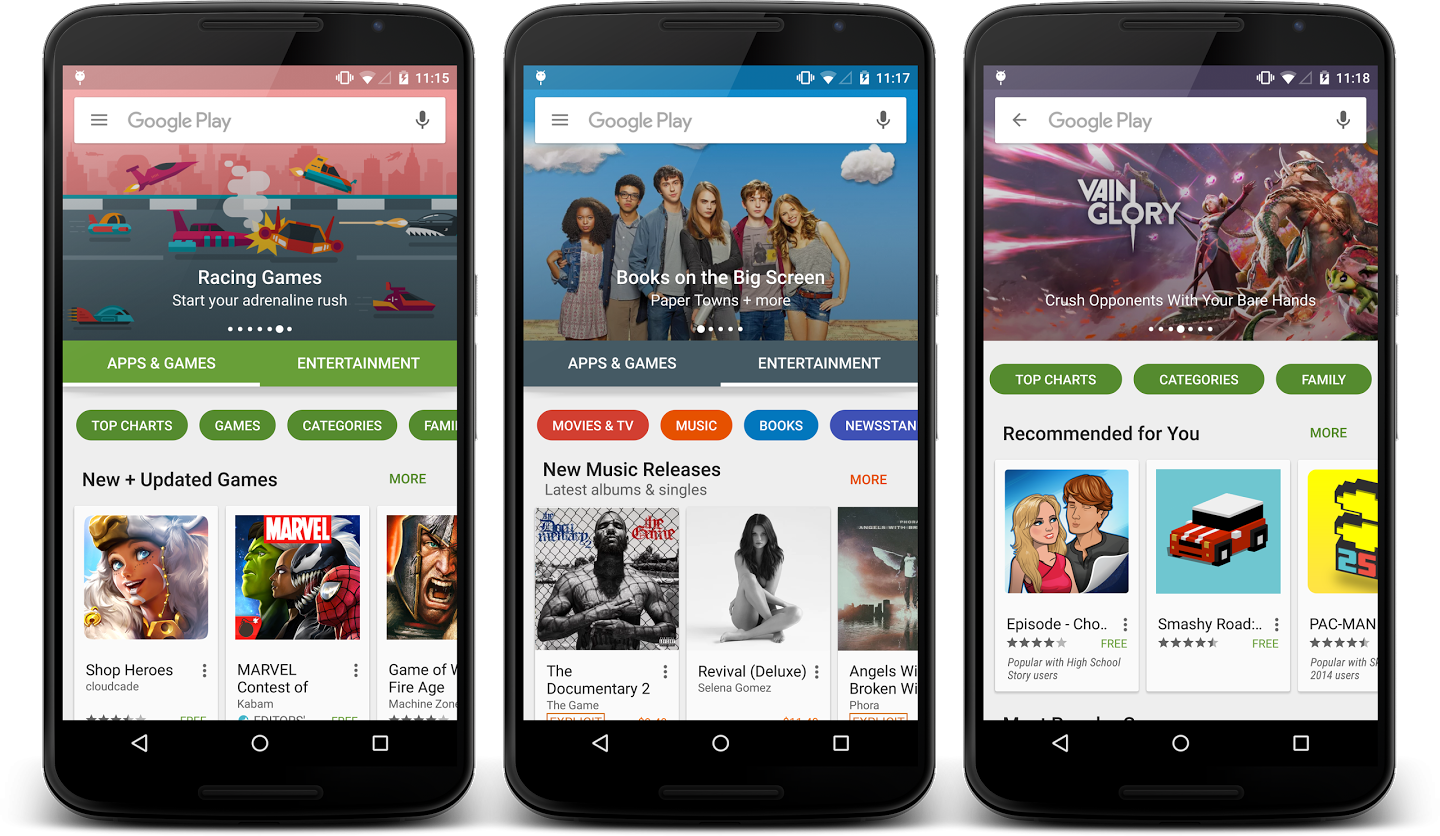
A redesign of the Play Store for Android has been in the pipeline for a little while and was more or less confirmed last week by Google developers. And now, just a few days after those comments were made, the new improved Play Store is starting to appear on selected gadgets.
From what we’ve seen – since we’ve not been updated yet ourselves – the new look interface for the Play Store is big, bright and bold and features a much cleaner and more simplified look. There seems to be less clutter and a bit more white space, though not too much so that items look lost. But some of the app icons and album covers etc. may be a bit on the large side, and you might not get too many items listed if you don’t have a tablet or sizeably screened Android mobile like the Samsung Galaxy S6 Plus.
What we like most is that there’s a new tab system where if you choose a main category like Apps and Games or Entertainment inviting and rounded tabs will appear allowing you to select, swipe and further filter your search, so you can look specifically for games or top chart apps under Apps and Games and Movies and TV, Books and Music will be filtered under the Entertainment section.It seems good timing for the new Google Play Store to arrive, what with Android 6.0 Marshmallow hitting devices as well, and just like the new operating software the Play Store update will be a gradual roll out starting its journey onto all eligible devices from today.
Also See: Android 6.0 Rolling Out To Previous Nexus Models
Also See: Android 6.0 – HTC Handsets Named in Unofficial List

