eBay has redesigned its logo after 17 years to a new simpler design which still holds onto the eBay colours and feel. eBay’s iconic logo has been around for a long time with the company’s overlapping colors and bold text theme – the logo was starting to look a bit dated and oh-so 90’s.
Devin Wenig, president of eBay, put in the release for the updated logo: “Our refreshed logo is rooted in our proud history and reflects a dynamic future. It’s eBay today: a global online marketplace that offers a cleaner, more contemporary and consistent experience, with innovation that makes buying and selling easier and more enjoyable. We retained core elements of our logo, including our iconic color palette. Our vibrant eBay colors and touching letters represent our connected and diverse eBay community – more than 100 million active users and 25 million sellers globally and growing.”
The company has demoed the new logo on a striking announcement page that features the logo alone on a white background, and the with the statement from Wenig regarding the state of eBay and the future they are looking forward to.
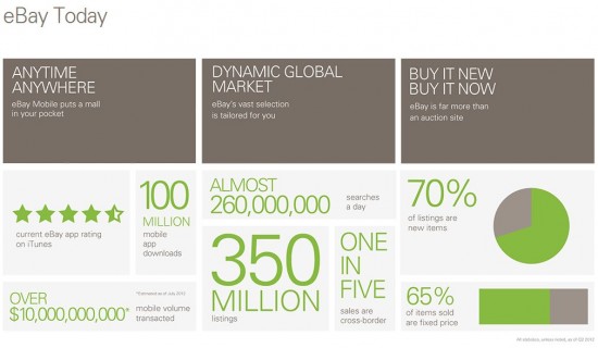
The announcement is also used to highlight the success of eBay’s mobile apps which have been downloaded 100 million times, and the company expects more than $10 billion in volume transacted via mobile this year.
Wenig stated “The eBay logo is known the world over, so changing it was not a decision made lightly. The time felt right”
Well Devin, we think you made the right choice and love the new logo!
The company is also keen to promote some of the successes the website and its mobile app have enjoyed by sharing some stats.

The new logo will be rolled out across eBay’s web properties from October but you can check out the site and how the image looks by visiting: http://pages.ebay.com/announcements/new/index.html.
Let us know your thoughts on our comments below or via our @Gadget_Helpline Twitter page or Official Facebook group.
