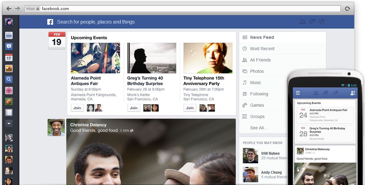
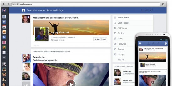
Facebook has revealed its new look News Feed in a plan to bring the appearance and functionality of the social site on all platforms into sync – and a number of Facebook users will be able to try it out ahead of their friends list!
Promising vibrant new visuals and a choice of feeds, the redesigned News Feed makes the most of every inch of space on the Facebook home screen. It’ll be packed with our pictures and posts and those from our online pals which fill the width of the screen and photos will now introduce the description in white text overlaid at the top of the image, which was a topic of discussion some time ago.
Tabs to the left of your post will show the faces of those who have recently liked the article, adding a charming and personal touch to the formerly quite cold looking interface.
When you make a new friend Facebook will now let everybody know about it, sharing the news in a banner style info blast that like everything else on this revamp is BIG. Your upcoming events and mate’s birthdays are promoted similarly meaning you should never miss an important occasion.
Filtering of the New Feed has been around for a while, but has become a much forgotten feature lost to the side of the screen. In the update the filtering of Most Recent posts, Photos, Music, Games and Groups will shift to the right of the screen and will be more prominent and presented slightly more attractively.
This cleaner, fuller Facebook experience will be brought to both desktop and mobile app versions and those interested in getting it first can now join a waiting list for the News Feed update which is yet to be given a launch date. Visit the link below for the full details and to sign up.


