If there’s one type of change that’s sure to irk people more than most, it’s change to technology. People seem to hate it when companies mess with an existing formula – think the Facebook timeline, iOS 6 Maps and every year when the new version of Call of Duty comes out.
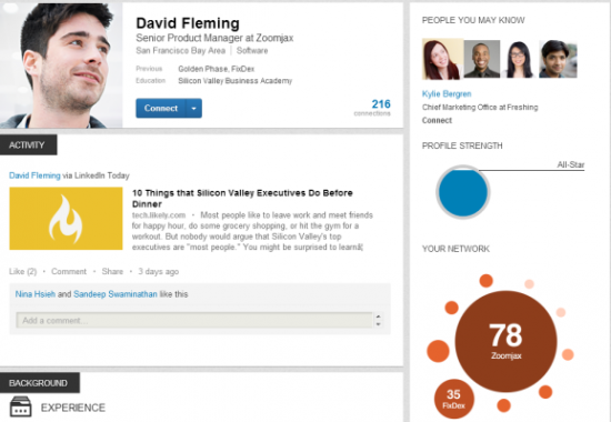
Business-centric social network LinkedIn has announced it will be introducing a totally revamped profile page layout starting from now and running up until Christmas, and we have to say we’re already big fans. LinkedIn is a great tool, but up until this change it’s looked very drab and boring in our opinion.
The new style changes all of that, and it also opens up the chance to make your profile page stand head and shoulders above the rest. You can request an invite to get the new look profile page now, but if you don’t it should change automatically over the coming months. Whether you actively go out to request it or it comes to you, here’s how to take advantage of the new look LinkedIn profile page to make yours the best it can be.
Book a photoshoot
Obviously you’re not going to book a photoshoot, unless you’re really vain, but we’d strongly recommend making sure you’ve got a nice profile picture to suit the new look page. The focus is on making a great first impression when people hit your page, so the profile picture area is very prominent, with the image itself being bigger. Aim to catch the eye – your current title, previous jobs and education are also listed right here.
Use LinkedIn more
The new look page brings in a pretty big ‘Activity’ ticker on your profile page, sort of like Facebook’s news ticker but personalised to just you. From here people will be able to see what changes you’ve made, who you’ve connected with and even what you’re doing now. Potential employers will be able to see if you’re being proactive in your current job, and colleagues will be able to interesting content you’ve read. This is directly below your lovely new profile picture, so in theory will be the second place people will pause to look.
Like, Comment and Share
LinkedIn’s similarities with Facebook don’t stop at the activity ticker – oh no. You’ll be able to comment on the activity of other users, as well as liking and sharing posts. The more you do this, the more people are going to notice you, and consequently you’ll be filling up your Activity ticker.
Look experienced
Scroll a little further down a new look LinkedIn profile page and you’ll find a much bigger area for previous experience. Your past jobs are now displayed bigger than before, with nicely bolded titles and a generous section below for your job description and experience. It’ll be worth editing your profile to pad this section out to really show off your experience, using perhaps 200 words for the perfect fit.
If you’d like to be one of the first to try out the new look LinkedIn profile pages, head on over to their site, log in and click the yellow button to request an invitation.
Let us know your thoughts on our comments below or via our @Gadget_Helpline Twitter page or Official Facebook group.

