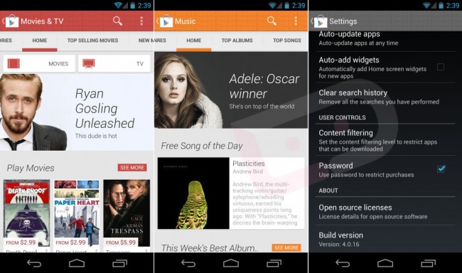
Its looking like Google are continuing on with their spring clean and shakeup as images and a video have appeared on Android specific tech website Droid Life of a brand new look and User Interface for the Google Play store App that is built into all Android running devices.
The images show that Google have done a massive re-design of is Play store application and gone will be the dingy black in favor for a clear and colorful images and more of a shopfront experience. The version 4.0 update looks to bring a cleaner look to marketplace and allowing customers to see music, Apps, Games and books easier.
Apart form the bigger images and colorful design there are not a huge amount of changes to the Play app but its a good start for Google and we can probably expect and update to the browser version of the Play store as Google continue to bring all of their Android and Browser based products inline with each other.
As you can see from the video the version listed is 4.0.16 of the new Play app but this may just be a working number for the update as the vid also reveals that most of the new pages are not live at this time, so its still very much a work in progress.
Source: Droid Life

