After making an unplanned debut on YouTube recently, Google’s new look redesign for the Play Store has now started officially rolling out to Android phones and tablets.
Google has been working on its ever expanding portfolio of Android apps and services recently to make them all much cleaner, brighter and easier to use. Unfortunately the Play Store has remained mostly black and cluttered, but this new update (version 4.0.25) looks set to sort that all out.
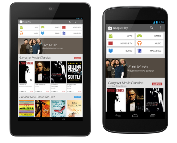
Black is gone and white is in with the new look Play Store, giving a much cleaner and more pleasant interface for us to work with. Google has put the categories right at the top of the home page to make things nice and easy to find, so we now have tabs for Apps, Games, Movies & TV, Books, Music, Magazines front and centre.
Images are also larger, with nice big tabs showing off the latest content and offers below the category tabs. Search, My Apps and Menu functions remain the same look and positioning; up in the top right corner.
The idea behind the redesign is to make it easier to find things in the Play Store as it bulges with content. It’s thought that there are now over 800,000 apps available in the Play Store, and with the recent addition of Magazines and new movies, music and books being added all the time, it’s a welcome change.
All Android smartphones and tablets running Android 2.2 and above will receive the update over the next 2-3 weeks.