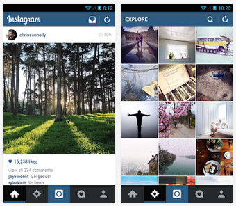
Android gadget-using Instagram fans looking to share pics of their breakfast may be greeted by a little surprise this morning as the photo filtering, social sharing app has received a fresh new look.
Weighing in at around half the size of the original app, the shiny new Instagram 5.1 update comes with the intention of quicker loading of your photo stream and more efficient uploading of your digitally altered snaps. The Instagram interface also now presents bold and clean symbols for all your filtering and editing needs, now all in one place at the bottom part of the screen. Shifting between the photo stream, exploring, taking a shot, your interactions and your own library is now nice and clear and easy to navigate.
An issue that sadly hasn’t been addressed is the ambiguity of some of those buttons, which have not been updated with written labels meaning that relative newbs (such as I) still need to jab blindly at the icons to locate specific features and functions and get your bearings. But once familiar with exactly where everything is and what it all does the Instagram redesign does offer a much better and cleaner user experience with simple outbound social sharing to Facebook, Twitter, Tumblr et al. Buttons are smaller, meaning that you have more screen real estate to view your pics.
Instagram version 5.1 is available now for smartphones and tablets using the Android OS 2.2 and upwards. The update should occur automatically on most devices, or can be snapped up by visiting the Google Play Store.


