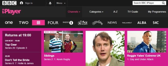
As BBC Three prepares to go online-only the broadcasting corp. has released a first look at the station’s brand new logo. And it’s raised quite some exclamation.
Even the BBC’s own website has highlighted the criticisms made against the redesign since it was revealed and taken it in jest and the head of BBC Three (sorry, that’s BBC II!) is not worried about the ridicule received on social sites such as Twitter.
It’s not the first time that the BBC Three logo has received a revamp and has gone from featuring a bold and capitalized THREE to a more stylised conjoined Three. The BBC explains the new logo is intended to work better as an app icon and a better fit for the move to web.
The new BBC Three logo has been added to the BBC iPlayer alongside BBC 1, BBC 2 and before BBC 4 and despite looking a bit out of place still offers a full selection of live and on-demand programming.
BBC Three has been broadcasting as a television channel available on Freeview and subscription services such as Sky and Virgin TV since February 2003. It will close and will make a full move to iPlayer in February 2016 after thirteen years of service.


